
Fatima Bouhaouche
UI/UX & Product Designer
 Case Study, 2024
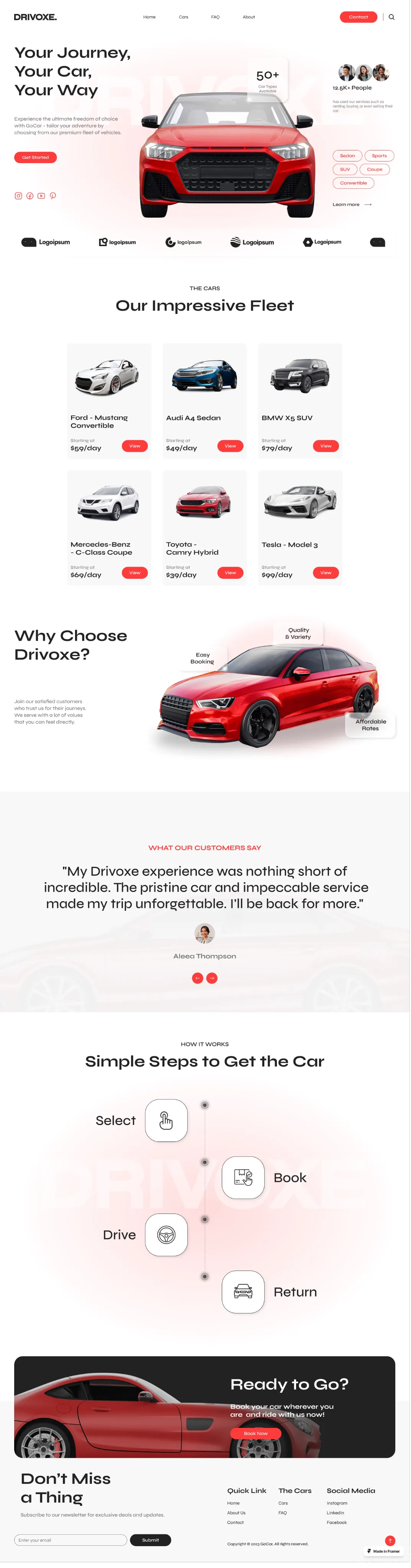
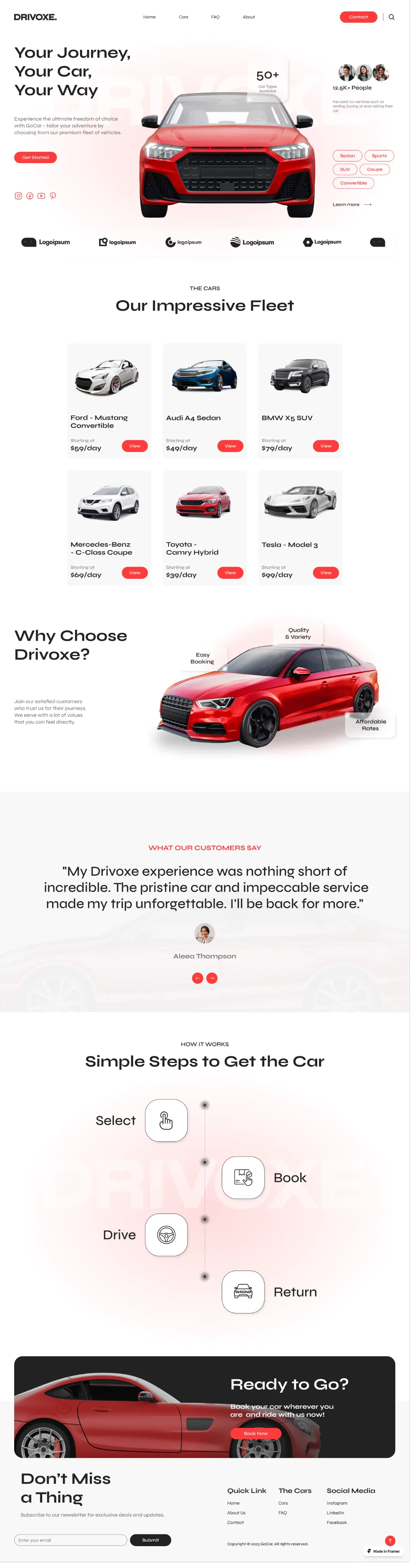
Drivoxe. Car
A car rental platform designed to simplify vehicle discovery, comparison, and booking through a clean, user-focused interface.
Overview
Drivoxe aggregates car rental listings from multiple providers across the Gulf into one comparison platform. I led the redesign of the search, comparison, and checkout experience for the platform's cross-device relaunch.
The Problem
Comparing cars across providers meant juggling several open tabs, and hidden fees only appeared at the final checkout step, causing a steep drop-off right before payment. Nothing in the interface built confidence that the final price was actually final.
Goals
-
Let users compare vehicles across providers without leaving the app -
Show a transparent, itemized price breakdown before checkout -
Reduce checkout drop-off caused by late fee surprises -
Keep the experience consistent between web and mobile
81%
of reviewed session recordings showed users opening two or more browser tabs to compare providers manually.
#1 reason
cited in support tickets for cart abandonment: fees that appeared for the first time at checkout, after the price had already been 'decided.'
Unclear inclusions
users couldn't tell whether a listed price included insurance until the very last step of booking.
How I got there :
Process
Discovery & Research
Analyzed session recordings and interviewed 6 renters to pinpoint exactly where checkout abandonment spiked.
IA & Comparison Model
Designed a side-by-side comparison model so users could shortlist vehicles across providers in one view.
Wireframing
Prototyped an itemized pricing breakdown shown at selection, not just at final checkout.
Visual Design & Prototyping
Built a clean, confidence-driven visual system with consistent components shared across the web and mobile builds.
Usability Testing
Ran comparative tests against the old flow, tracking completion rate and time-to-checkout across both versions.
Handoff
Delivered a shared component library so web and mobile engineering could ship from a single source of truth.
Why I designed it this way :
Key UX Decisions
Decision 01
Comparing cars across providers required leaving the app and opening competitor tabs.
Built a side-by-side comparison view so users could shortlist vehicles from different providers on one screen.
Removed the tab-switching behavior seen in session recordings, comparison became a native part of the flow.
Decision 02
The 'final' price at checkout was often different from the price shown during search, because fees were added late.
Moved the full itemized price breakdown, base rate, insurance, fees, to the moment of vehicle selection, not checkout.
Eliminated the late-stage price jump that support tickets cited as the top reason for abandoned carts.
Decision 03
Web and mobile had been designed independently, so returning users had to relearn the flow depending on device.
Unified both platforms on a single shared component and interaction library.
Gave users one consistent booking model regardless of device, cutting confusion for repeat bookers.
“Showing the full price breakdown earlier felt risky at first, but it's the single change that had the biggest impact on completed bookings.”

Contact Me
Set up a time to talk about your design needs.
Designed by Me