
Fatima Bouhaouche
UI/UX & Product Designer
 Case Study, 2023
Eighty Eight GYM
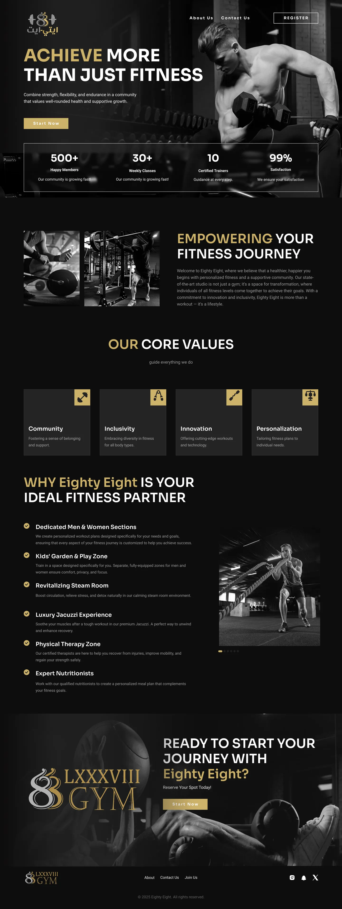
A modern gym website focused on membership plans, class discovery, and a strong fitness brand experience.
Overview
Eighty Eight GYM needed a website that matched the energy of their studio and actually converted visitors into members, not just a digital brochure. I redesigned their site with a sharper brand identity and a funnel built around membership sign-ups.
The Problem
The old site buried pricing and class schedules behind multiple clicks, had no clear call-to-action above the fold, and didn't reflect the studio's bold, high-energy brand in person. Most visitors bounced before ever seeing a membership plan.
Goals
-
Get membership pricing and plans visible within one scroll -
Build a bold visual identity that matches the in-studio energy -
Make class schedules and trainers easy to browse before signing up -
Design a clear, low-friction membership sign-up funnel
68%
of visitors left the homepage without ever seeing pricing, according to a heatmap and scroll-depth review of the existing site.
Top objection
in the studio's own intake calls: prospects couldn't tell what a class actually involved before showing up.
73%
of site traffic was mobile, yet the mobile experience was just a shrunk-down copy of the dense desktop layout.
How I got there :
Process
Brand & Discovery
Audited the existing brand assets and studio photography, then defined a bolder visual direction rooted in the '88' mark.
Sitemap & IA
Restructured the site around three visitor intents: browse classes, check pricing, and meet trainers, each reachable in one click.
Wireframing
Prioritized a conversion-focused homepage with pricing and a primary CTA above the fold.
Visual Design
Designed a high-contrast, editorial layout using bold typography and studio photography to carry the brand's energy online.
Build Handoff
Delivered responsive specs and worked with the studio's developer through a Webflow build for pixel-accurate launch.
Why I designed it this way :
Key UX Decisions
Decision 01
Pricing was buried three clicks deep behind a generic 'Membership' nav item.
Put a pricing snapshot directly in the hero section, above the fold, on both desktop and mobile.
Shortened the path from landing to seeing a plan from 3 clicks to 0.
Decision 02
Class descriptions were paragraphs of text, so visitors couldn't judge intensity or fit before signing up.
Paired each class with a scannable tag system, intensity, focus area, duration, instead of prose.
Gave visitors a fast way to self-select the right class, addressing the top objection surfaced in intake calls.
Decision 03
The mobile site was a shrunk desktop layout, not a mobile-first design, despite mobile being 73% of traffic.
Redesigned the homepage mobile-first, then adapted it up to desktop instead of the reverse.
Aligned the primary experience with how the majority of visitors actually browsed the site.
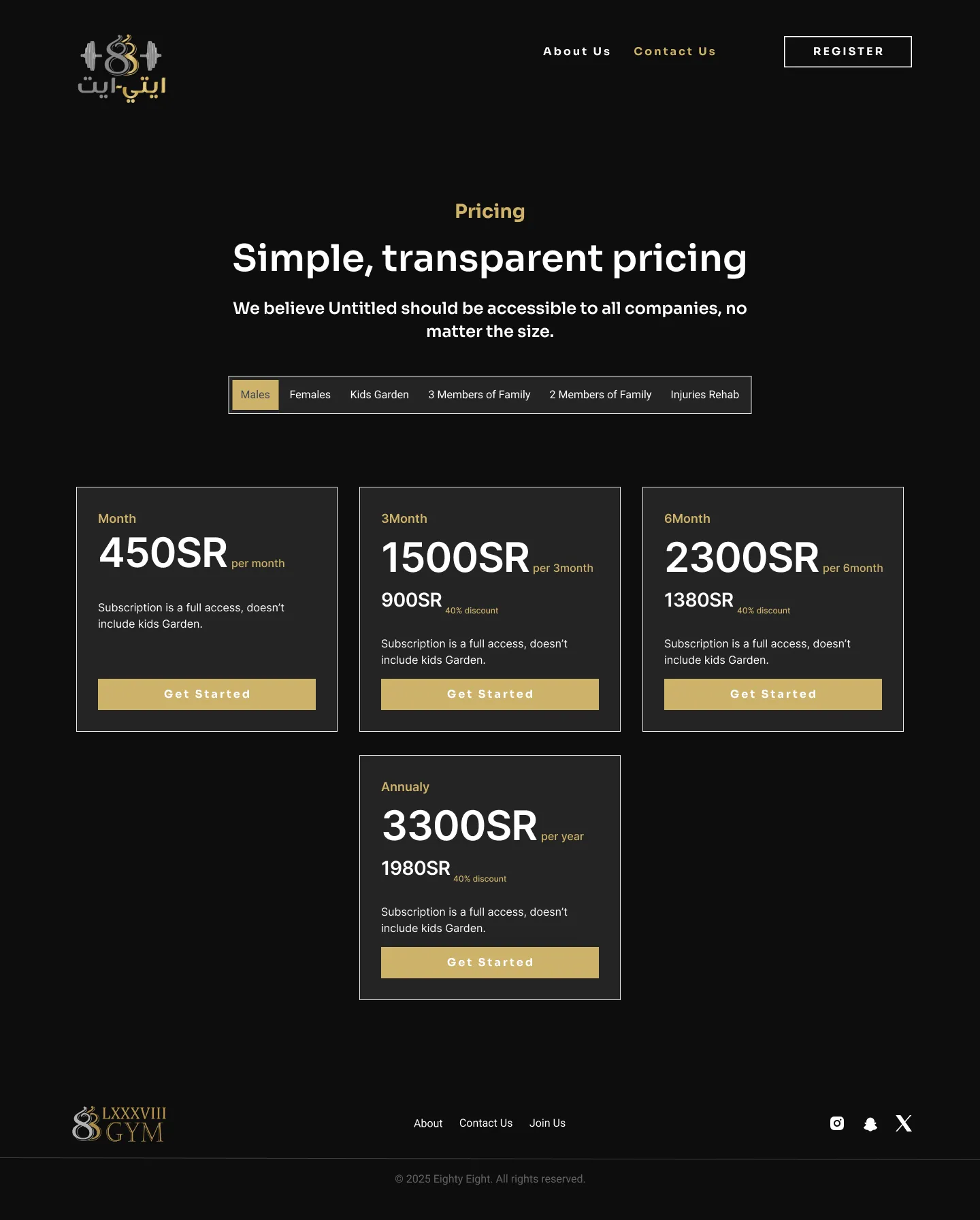
“Our website finally looks like our brand feels. Inquiries picked up within the first two weeks of launch.”

Contact Me
Set up a time to talk about your design needs.
Designed by Me